top of page
LOGO DEVELOPMENTS:
LOGO DEVELOPMENTS:
FINAL OUTCOME:
LOGO DESIGN:
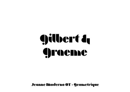
I chose this logo because I wanted my brand to have a more earthy style, as if the letters were growing into each other, and also because it was most associated with spring as well as flowers that bloom at the beginning of spring, which would be depicted on the packaging…
And also the small logo in the form of a G and an inverted C means “Gilbert and Graeme” and “Chocolate”. I put them in this way also because I wanted it to symbolize harmony and balance.
TYPEFACES:
FSP DEMO WTC LITO REGULAR
Bold font with a bit of noise in it, represents vintage eco-friendly vibes. Mainly used for titles on packaging, posters and headlines.
Primary font
Futura PT
A classic yet appropriate font with a slight contrast in size for a refined finish. Used for all small and secondary text, typically as description on packaging
or any additional info.
Secondary Font
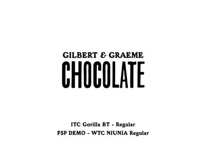
ITC Gorilla BT Regular
Funky font with rough edges which looks like the letters are melting as if they made out of chocolate
Font for logo
COLOUR SCHEME:
Each colour means each flower and each flower has its own meaning and symbolism. Each different package will have its own colour and its own illustration of a flower.
The idea came with the onset of spring when all the flowers bloom and when you want to buy chocolate for yourself or someone for your family, loved ones or just friends and acquaintances. By giving this chocolate you not only give the incredible taste but also wish them something good such as love, endurance or harmony. The meaning of the flower (the one that is painted) and the wish for this person will be written on the other side of the packaging.
RHODODENDRON SUBG. HYMENANTHES
Wealth, protectiveness and wellbeing

SKIMMIA JAPONICA
Serenity, renewal and harmony
CAMELLIA
Love, loyalty and humility
DANDELION
Resilience, healing and hope
ORCHID
Beauty, elegance and strength
MAGNOLIA
Luck , purity and stability
bottom of page


