top of page

branding

The overall theme of my project is to create an urban style identity design for a coffee shop with elements of minimalism and an inspiring organic theme, which is reflected through an illustrative style.
Simply because I went for coffee with my friends every Friday after college. A cup of coffee that tasted better than any day of the week. There are only four Fridays in a month, hence the name Four Friday(s).
For this brand, I came up with a character who would be similar to me as a reflection of my inner world. In order for the café to create a welcoming and cosy atmosphere for all people.
LOGO DESIGNS


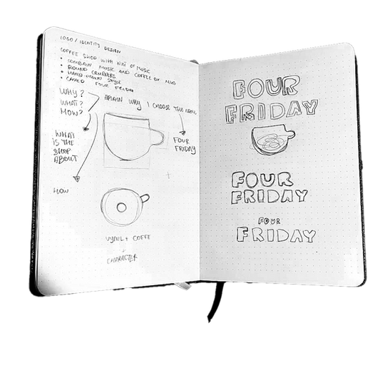
I wanted to create a logo that would combine 2 things: music, i.e. records, and the cafe itself, i.e. cups in the form of an illustration. Which didn't seem very successful to me. Since the original idea of the café was not only to be at home so that you could buy coffee and drink it, but also to be able to buy records and listen to them there too.
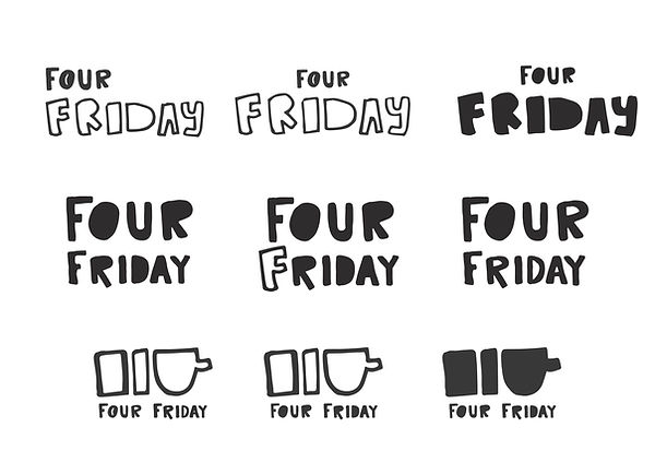
After that, I decided to focus more on the aesthetic and organic shape of the logo, which would demonstrate friendliness towards environmental trends, as well as locality and friendliness towards all people, which led to the shape of the handwritten style of the logo.

Since the name of the cafe is “Four Friday”, I wanted to create a simpler logo shape in the form of marks or some symbols combining the number 4 and the letter F. But the best logo was the combination of a cup and the letter de and the letter and in the form of two rectangular shapes.
TYPOGRAPHY

FSP DEMO WTC LITO REGULAR
Bold and fun font for titles and poster design, as well as UX and UI for headlines
Additional font
Since I was drawing the logo by hand on paper, I decided to create an alphabet for later use in branding. So I found a special website and created 2 alphabets for later use with empty large shapes and my handwriting.
dakota Rough Regular
Used for the name in the primary and secondary logos, also for headings
Primary font
Cascadia Mono Semi Light/
Cascadia Mono Regular
Used for all small and secondary text, typically on posters and menus
Secondary Font
colour scheme
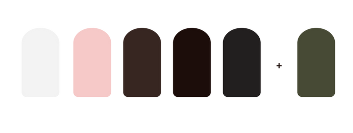
#474a35
#f3f3f3
#f6c9c8
#372621
#1c0d0a
#221f1f
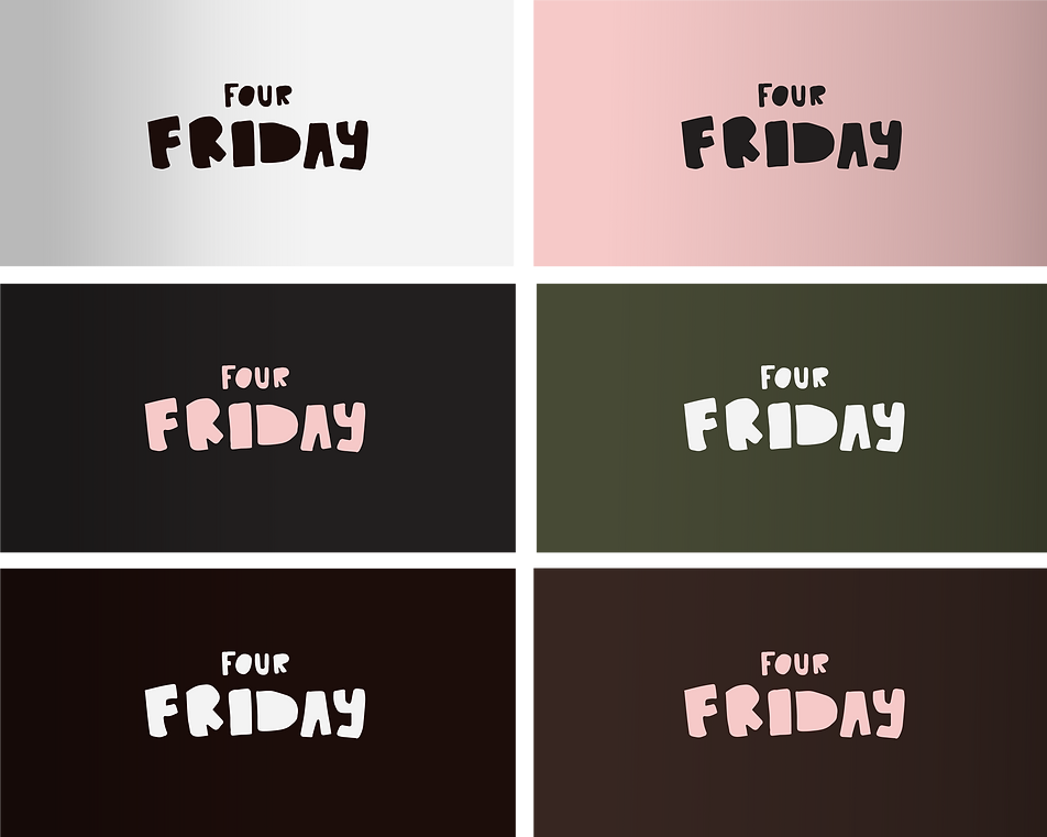
Initially I created 2 colour schemes, but I didn't like either of them because the first one was too brown and the second one was too cold + they didn't have a good contrast. But I decided to experiment and added a light pink shade and combined it with dark brown colours mixed with white. I also added an additional colour that is not the main one but can be used for an organic combinations.


bottom of page